About
At UWV I took on several projects, collaborating with UX designers, visual designers and product teams.
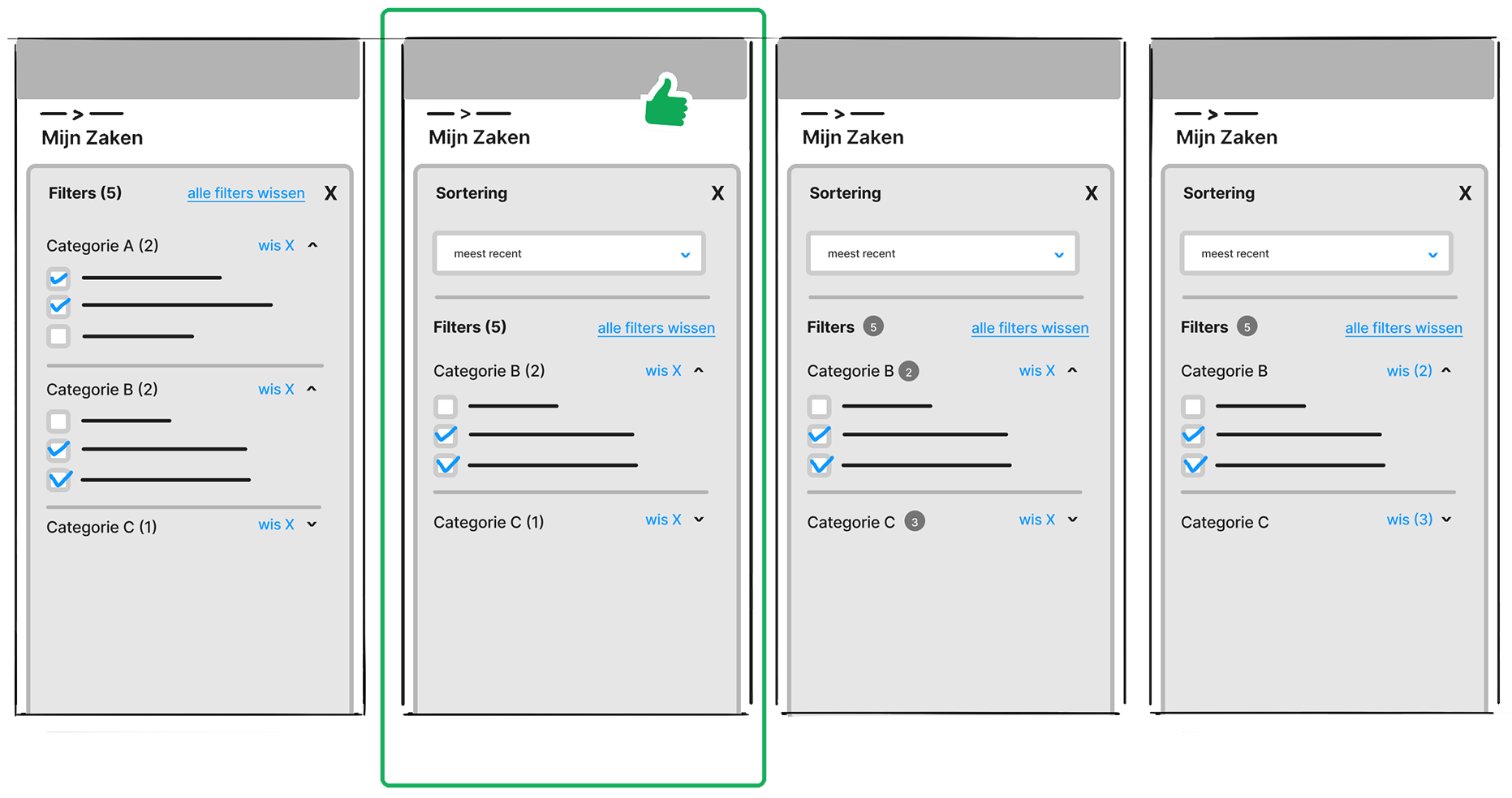
I researched design patterns to find what fit best in the contexts I was designing for. I did this as part of the objective but also to push the UX agenda in places where UX was merely seen as changing a screenshot. I also set up research with UX designers to validate designs and I contributed components to a novel design system.
The projects were messy and iterative. The first stage would be rough, letting my creativity run freely. In later stages other designers and stakeholders would judge higher fidelity designs on fit and feasibility. In the refinement stage I went back-and-forth with different types of designers. I could use my eye for detail and collaboration skills.
In all projects I had to deal with the struggles of legacy (trying to keep up the systems with user demands), inabilities of back-end and silos within the organization. However, with the tools handed I pushed through. I learned about accessibility and what this means for designing mobile-first as well.
The projects at UWV were messy and as such there was often not a clearcut end result.
Client
UWV, a Dutch government organ that helps unemployed people with supplying benefits and offering programs that help them find jobs.
Deliverables
I proposed small improvements to an internal portal, together with another designer I delivered the results of user testing a new form, and …

Approach
The objective of the design process was to draft a high fidelity design of the potential client’s homepage. A successful design would result in Rialto starting a full-length design process with my agency.
preferred style of the client, based on websites they submitted.
elements of their corporate identity.
the client’s target audience(s).
potential problems that their target users run into when using their website.
Iterations
Rialto sets itself apart by offering a careful program of independent European and world-wide cinema, thematic film series and support for new filmmakers.
Blerb
their many volunteers
programming tailored to the diaspora of Amsterdam
Another blerb:
film enthusiasts
young adults
User testing
Rialto wants to offer a cozy, local atmosphere for its cinema goers. This is reflected in the warm colors on their website and use of mostly soft, round fonts. Though the warm colors do a good job communicating coziness, they come across as dated. I created a bolder palette in which the colors are more saturated and contrast with each other.
Outcomes
I also wanted to set Rialto apart by making their website more playful. It’s one thing to not be stuffy, it’s another to show that you offer not just any cinema, but a careful, independent selection of worldwide movies and programs complementing it. This independence had to come through in the visual design. Therefore I did the following:
I went for standout fonts and made them bigger. Though not round, they draw the viewer in.
I created a more dynamic layout in which elements either slide in or seem like they do. The dynamic feeling is further emphasized by having elements overlap with each other.