Proposal for redesign of website
High fidelity redesign of Rialto cinema’s homepage. The goal was to reflect their independent spirit and local identity, while improving the experience for their diverse audiences.
Client
Rialto, an arthouse cinema with locations in De Pijp and Buitenveldert, Amsterdam.
Deliverable
I proposed a redesign of their current homepage incorporating several interactive elements.

About
The client felt the code of their website was outdated, as well as its design. They wanted to serve their diverse cinema goers better by having a more tailored offering.
To give the client a taste of what a better user experience could look like, I redesigned their homepage. This was part of a proposal my agency submitted for a tender.
Current design of Rialto’s website
Approach
The objective of the design process was to draft a high fidelity design of the potential client’s homepage. A successful design would result in Rialto starting a full-length design process with my agency. This would allow me and the developing team to dive deeper into their users’ challenges, define their needs and to improve their experience through design.
Discovery and insights
Due to a limited time frame there was no room to look into strategy. Instead, I ran a shortened design cycle that started off with collecting information about their style and their users through an intake form and their website. I also ran a shortened UX audit of their website. I looked into the following:
Style
preferred style of the client
visual identity of client
Users
client’s target audience(s)
potential problems of their target users when using their website
Design evolution & result
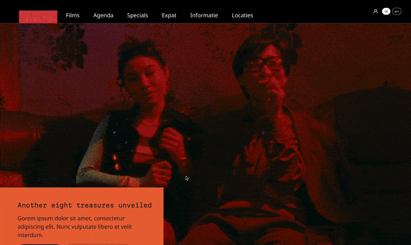
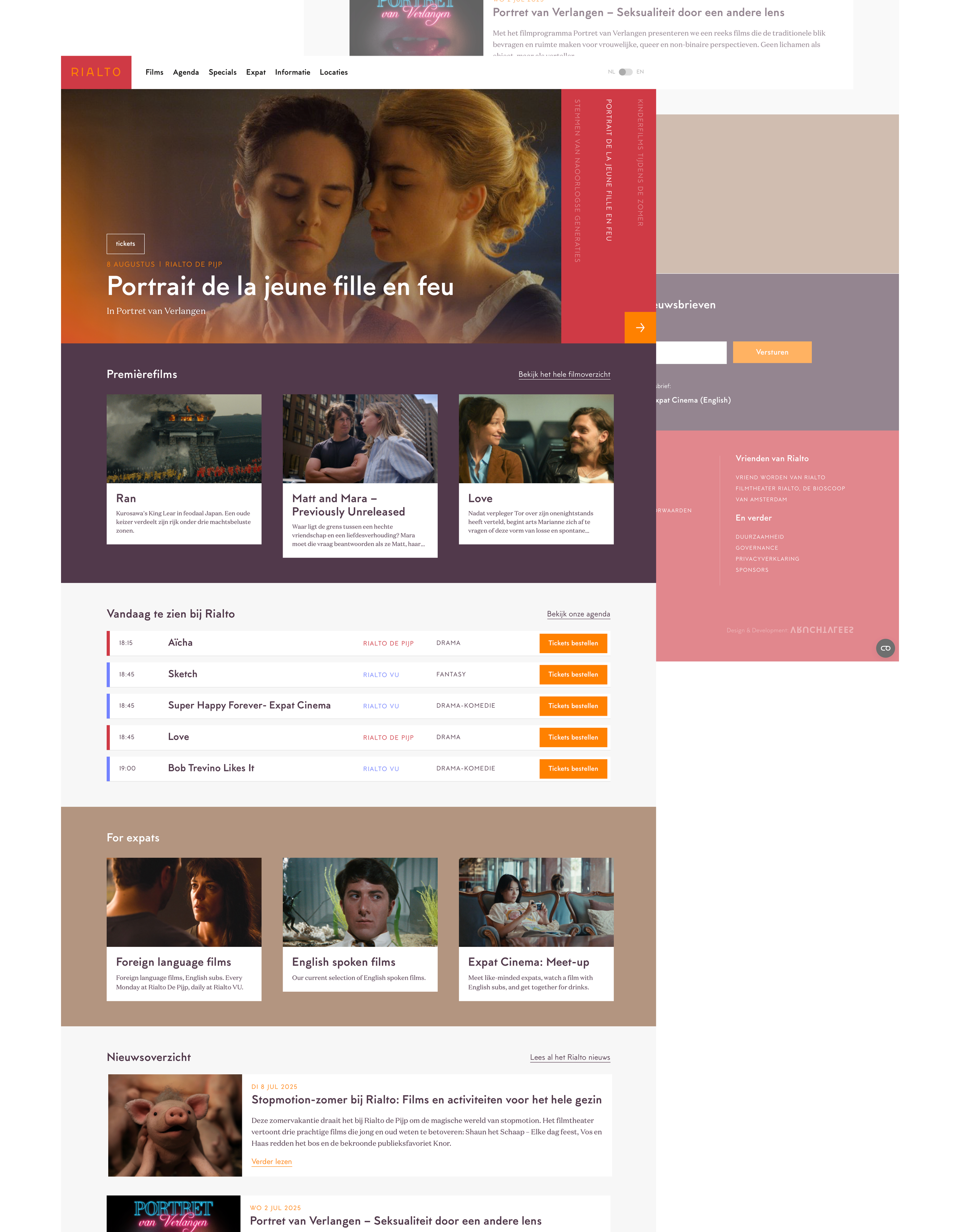
Once I had collected the insights I set the tone for Rialto’s new look - bold colors, inviting typography and a visual language that felt warm yet modern. I already had a loose idea of the homepage sections, but - true to the messy nature of creativity - these formed naturally as I experimented with the chosen colors and typefaces.
By playing with the design before committing to strict wireframes, I explored Rialto’s visual identity more deeply and created a look that immediately draws visitors in, giving them a clear sense of what Rialto stands for.
I fine-tuned the look and made clear sections that each had a clear purpose: to share information with the user or to encourage a type of conversion through a clear call to action.
The final prototype leaned more into UI than deep UX, delivering a fresh visual direction for Rialto. While the client took a different path, the design sparked new ideas for how their online presence could evolve.
Insights
Rialto is not your average cinema. Not the commercial kind that mostly serves up blockbusters — it stands out even within the independent arthouse genre.
Their offering is carefully selected and also curated for the diverse makeup of Amsterdam. This emphasis on the community in Amsterdam also shines through in them supporting and inviting their local community through several initiatives.

Upcoming filmmakers presenting their work at Rialto for Short.
Positioning
Involvement of local community
many volunteers work at Rialto
programming tailored to the diaspora of Amsterdam
movies and workshops for families
a platform allows students to collectively review and discuss movies
both theaters are cozy, comfortable and personal and invite their audiences in
Cinematic offering
a careful program of independent European and world-wide cinema
thematic film series
support for new filmmakers (Rialto for Short)
Their audiences
film enthusiasts
young adults
families and children
cultural and diaspora communities
local, diverse Amsterdam residents
Visual identity
Rialto wants to offer a cozy, local atmosphere for its cinema goers. This is reflected in the warm colors and gradients on their website and use of mostly soft, round fonts. Though the warm colors do a good job communicating coziness, they come across as dated and do not match the uniqueness of Rialto.
The color palette is generally coherent. However, several blue and blue-green solids and gradients are used on other pages that take away from the warm style.
The layout of texts is also not entirely consistent: one of the main overview pages strays away from the standard layout that guides the eye.
Several elements of Rialto’s website show issues with consistency and contrast.
User experience
The current website doesn’t clearly communicate who Rialto’s offering is for. While expats have a dedicated homepage section and navigation link, programs for other communities are hidden deeper in the site.
Interaction patterns sometimes break user expectations, and certain elements lack clear copy or hover states to signal they’re clickable. For example:
the filter on the page ‘Calendar’ does not give the right amount of feedback and the feedback is inconsistent
footer links styled the same as flat text make it unclear what’s interactive.
There are accessibility issues throughout the website due to low color contrast across the palette.
Lastly, content blocks are not optimized for dynamic content. On the ‘Events’ page, containers vary in height and run into the next row when text is too long, making overviews harder to scan and maintain.
The calendar’s filter suffers from poor placement, selection and feedback cues.
Design solution
Style
Bolder visual identity
I wanted to capture the uniqueness of Rialto while still keeping the coziness of the current website. I created a bolder yet still warm palette in which colors are more saturated and contrast with each other. The contrast also helps increase digital accessibility.
Communication of character
I also wanted to set Rialto apart by making their website more playful. It’s one thing to not be stuffy, it’s another to show that you offer not just any cinema, but a careful, independent selection of worldwide movies - and programs complementing it. This independence had to come through in the visual design.
I did the following:
I went for standout fonts and made them bigger. Though not as round, they draw the viewer in.
I created a more dynamic layout in which elements either slide in or seem like they do. The dynamic feeling is further emphasized by having elements overlap with each other.


User experience
I made the most important audiences more clear by giving each group its own section within the ‘Films voor iedereen’ block. As users need to quickly see which movies are currently playing and when, followed by a clear call to action, this information is placed right after.
The prototype