Redesign of website
Redesign of a school group’s digital presence — from outdated, fragmented websites to a unified, accessible multiwebsite aligned with their new brand identity.
I co-led several discovery workshops and turned the insights into a foundation for iterative design exploration. Through close collaboration with stakeholders, I turned the iterations into a high-fidelity prototype ready for handoff to the next UX designer. Along the way, I navigated challenges around scope, accessibility, and alignment—transforming a fragmented web presence into one cohesive experience.
Client
Comenius college, a comprehensive school in the Rotterdam region. Part of the CVO school group, they offer a wide range of levels and programs for students.
Deliverable
Through different iterative stages I proposed high fidelity wireframes of all the website pages, a site structure for all Comenius schools, and eventually a high fidelity prototype of the homepages.

Approach
1. Discovery and problem definition
I started with a UX audit of the existing websites and initial conversations with the client to understand their goals for the redesign. This was followed by two workshops with key stakeholders, aimed at clarifying what worked, what didn’t, and how the new platform could best align with the refreshed brand identity. Together with a strategist, I mapped user journeys, defined the primary audiences (parents, staff and students) and identified their core needs. This phase established the strategic direction.
2. Analysis and proposal
I used the insights from the workshops to cluster findings and identify recurring themes. I turned these into recommendations for the online experience of the schools. A major step was defining a unified navigation structure that would work across multiple school websites. I then created a strategic advisory report that outlined opportunities, risks, and the proposed information architecture. While I would have preferred direct user testing, this analysis provided a strong baseline for design decisions.
3. Design iteration
I translated the proposed experience into low-fidelity wireframes. These clarified layout, content hierarchy and navigation flows of all the essential and unique pages. Through several review rounds with the client, I refined components and addressed misalignments. A key learning moment was when scope creep arose around an unbudgeted feature. I had to re-establish expectations and highlight the importance of aligning scope before investing design hours.
4. Prototype
When moving to visual design, the new brand identity introduced several challenges. Some colors did not meet accessibility contrast standards, creating tension between brand and usability. I proposed accessible alternatives, but the client insisted on their palette. As a compromise, I implemented a contrast toggle, allowing users to adjust the interface while preserving the brand look. This solution balanced user needs, accessibility requirements, and client wishes.
5. Finalization and reflection
After iterating on key pages and ensuring consistency across the whole multi-website, the design was handed off to another UX designer for further detailing. Looking back, this project taught me the importance of proactive communication around scope, of standing firm on accessibility, and of shaping messy client input into clear strategic outcomes. It also strengthened my ability to balance business demands with user experience principles.
Discovery and problem definition
In the discovery phase I got a sense of the current user experience of the school websites, as well as the goals and perceived problems of the client. I did a run through of the websites to see what information was offered and how, how users are directed and if this is successful. I also went through the redesigned brand book to establish the school values and how these were translated to a visual language.
Some noteworthy issues that arose from the UX audit

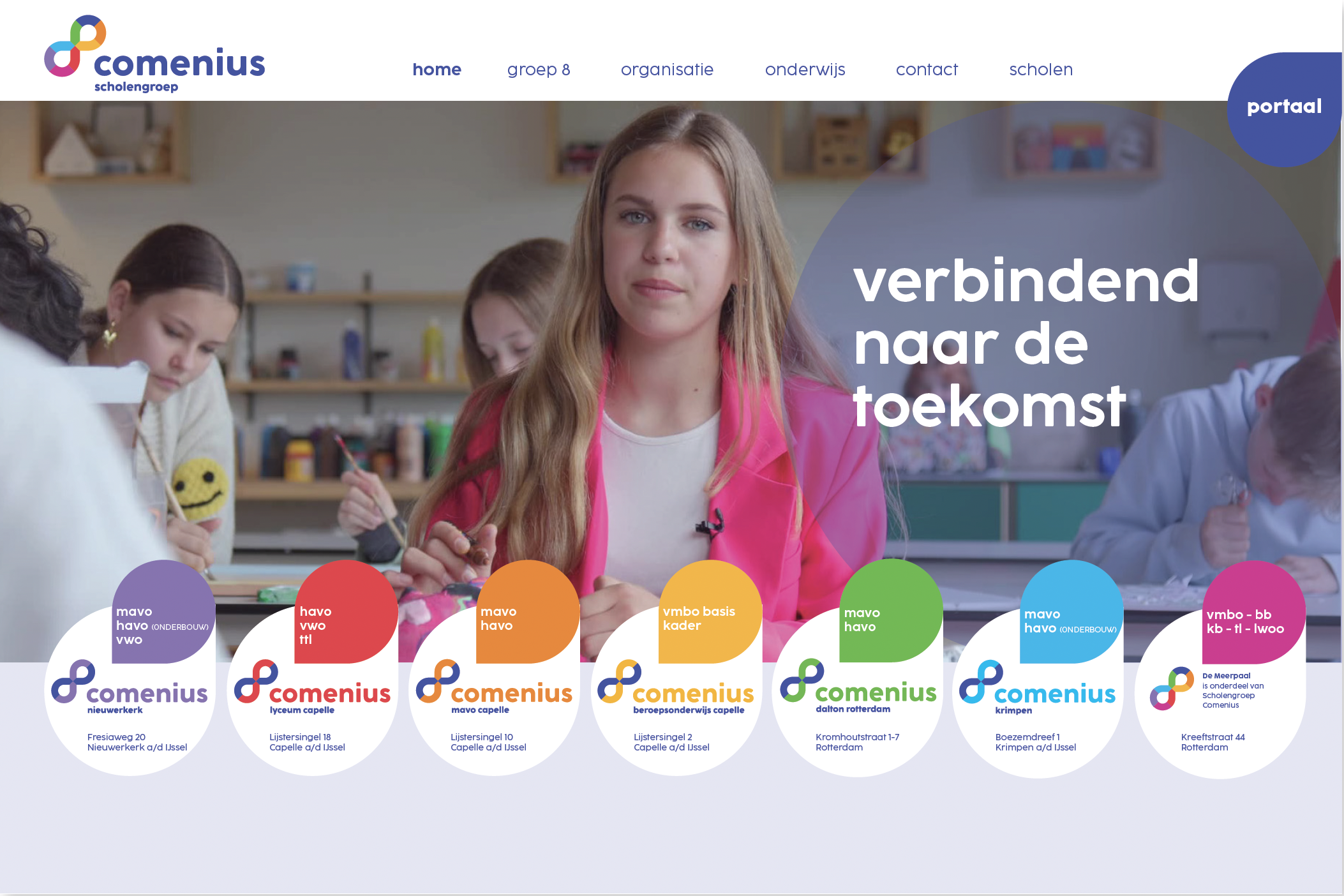
Selection of visual elements from the brand toolkit showing use of color, typography and contrast.
2. Analysis and proposal
I co-lead two strategic sessions with relevant stakeholders of Comenius. Through a series of guided questions, I uncovered the issues they faced while using their website, and their knowledge of their end users and how they move through the websites. We also looked ahead and set goals for what the website should help achieve.
Clustering these insights helped determine the experience the website should offer and how this could be supported. I bundled this proposed experience in an advisory report.
Workshop insights
Clustering the insights

Advisory report based on analysis
The advisory report provided the client with a clear view of their website, combining identified pains and gains with both stakeholder wishes and user goals. The deliverables included:
KPIs to measure success
personas of current and prospective parents and students
an ideal customer journey
proposed site structures for each Comenius school website
a breakdown of required functionality, forming the basis for components (e.g. text–image containers, forms)
The report also highlighted key challenges and opportunities. One important limitation was that insights were filtered through the client rather than gathered directly from parents and students. This meant the picture of user needs could be skewed. Future iterations of the project should therefore also focus on user interviews and testing to validate assumptions and ensure the website truly supports its end users.

Insights and proposals from the report, such as a persona and site structure.
3. Design iteration
In this phase I translated the proposed experience into tangible design directions. I began by creating low-fidelity wireframes to explore layout, content structure and use of components. These early sketches served as a conversation tool with the client, helping me clarify what each page needed to communicate.
I then brought the brand identity into the designs. The print-based identity didn’t translate neatly to web, and my focus on accessibility and a usable, user-centred structure sometimes clashed with what the client expected to see. Through several iteration rounds I worked to shape a design that respected their brand while still functioning well for real users.
Wireframes
Establishing the digital brand identity
Challenges
The brand identity developed by an external agency was designed primarily for print and did not translate well to an accessible, responsive website. This was especially true for the proposed color palette and layouts, which were not suited for content-heavy webpages . The agency’s suggested homepage redesign also revealed a lack of web expertise: at smaller screen resolutions containers would shift unpredictably and dynamic text would overlap with images. An example is the H1 in the hero, which was placed neatly beside a face in the mockup, but is unworkable in practice.
Through design iterations, I proposed alternative color palettes and a more scalable, accessible hero section. However, the client felt these solutions strayed too far from the fresh, colorful spirit of the brand.
This tension highlighted an important challenge in my role: finding the balance between honoring brand identity and ensuring accessibility, scalability, and long-term usability.
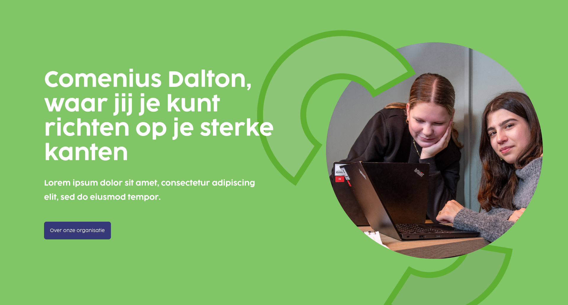
Proposal of the brand agency.
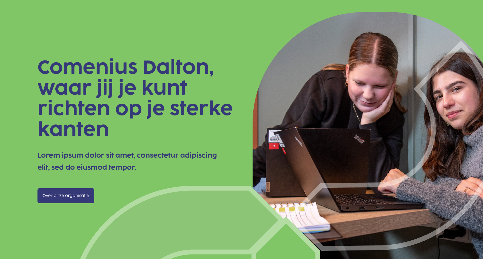
Design iterations


4. Prototype
Creating consensus
In this stage I focused on reaching agreement with the client about the look and feel of the components, the use of colors, and how content would be positioned on the page. Much of the feedback was cosmetic and because meetings were difficult to schedule, discussions often repeated earlier points the client had forgotten. The hero section in particular proved challenging to get approved, as it became the focal point of differing expectations. Through several iterations, we worked toward a version that satisfied both usability requirements and the client’s vision.
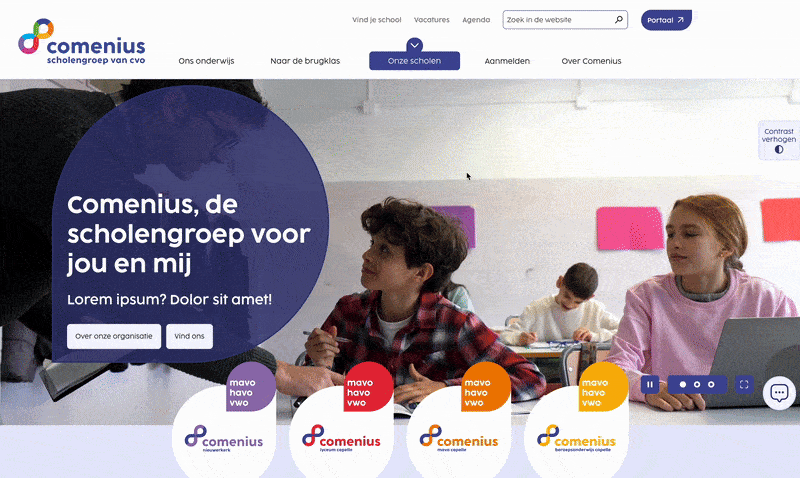
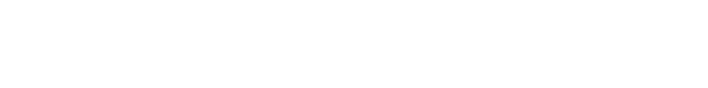
An overview of the interactive homepage of the general Comenius website.
5. Finalization and reflection
As the project went into the final design stage, I gradually handed over responsibilities to the next UX designer on the project. Before handing off, we collaborated on fine-tuning the designs with the client and set up the system for extending the brand identity across the individual school sites — each with its own primary color as a point of recognition.
Although I wasn’t involved in the final delivery, the process taught me valuable lessons. I learned how critical it is to align scope early to avoid wasted effort, how to stand firm in advocating for accessibility even under client pressure, and how essential direct user research is for validating assumptions.
